The Good Sauce Co.
(Concept brief)
A sauce company, family ran and built up into a subsequent restaurant made with Mama’s recipes!

A heartfelt and genuine business with value and real people. This was important to communicate and was a leading point in discussion with the client. A simple and familiar brand identity that has a comforting and also professional appearance whilst still feeling like it is hand-made and real. A primary logo with a combination of the icon and type that can also be isolated and stand alone separate from each other maximised usability to the client across sauce and restaurant usage, this was a route that the team favoured over any alternatives of the logo and subsequent logo use in patterns and packaging followed suit.

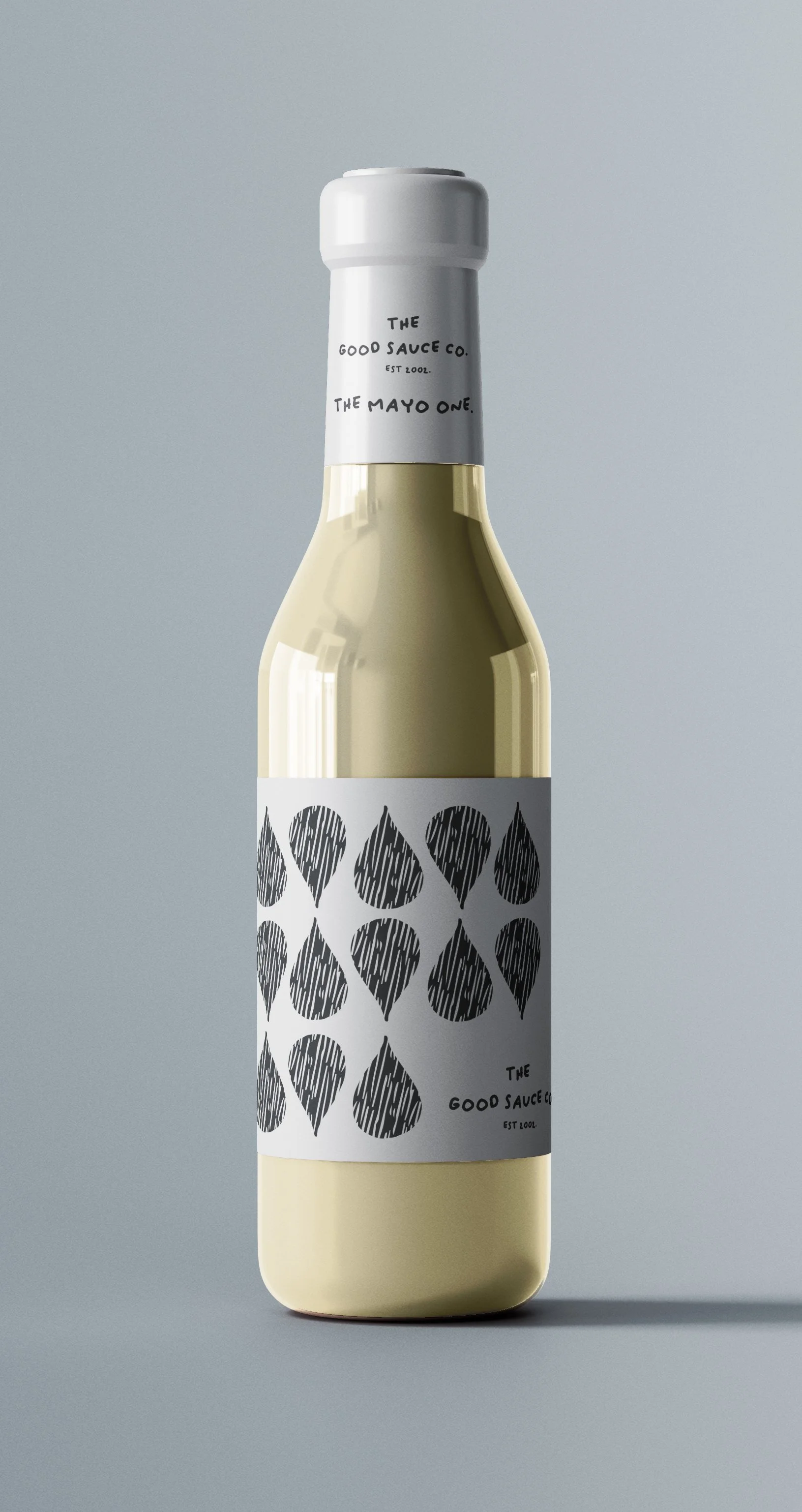

The water or sauce drop with the texture resonated with the client in a childhood filled with Mum’s cooking tasting a drop of the meals and sauces she made. This mixed with the childlike drawing texture, successfully created the homely and nostalgic appearance the business were so keen on portraying. Throughout we kept the brand core values at the forefront of the reasoning’s for design choices; Warm, homely, familiar.

Working with small independent businesses is always an intimate experience, real people and the origins of the businesses shine through, developing an identity and developing a visual representation of who the business and the people in it are is such a welcome challenge to the team. We offer support and guidance throughout and give as much information as the clients need in their journey of bringing their ideas and dreams to reality.
Do you have a project for us?
Well get in touch today, fill in our handy contact form and we can arrange a chat to discuss how we can help! We have highly qualified designers and artists that can help in a range of applications so get in touch and bring your ideas to life today!